The Spark is our primary logo.
It’s an iconic visual shorthand for Walmart that’s bold at any scale, and represents our brand clearly anywhere it shows up.
The Spark
Spark Overview
The Spark is our most iconic symbol and the quickest shorthand for the Walmart brand, radiating energy and optimism wherever it appears.
The Spark can appear alone as a representation of Walmart or with our wordmark in the same composition, but they should never be placed right next to each other. See Layout page ‘Applying Logos’ for placement guidance.
Spark Notes
Evolution
The original Spark was introduced to the world in 2008. Our new Spark has been refreshed and redrawn with organic curves that feel approachable and less rigid.

Spark Notes
Construction
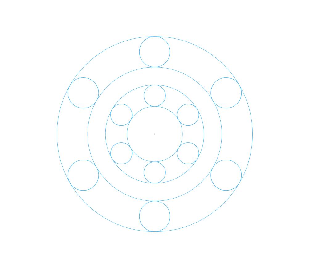
Our Spark is drawn using pure geometry. It’s based on circular endpoints, giving it a balanced structure. It all rotates evenly at 60º around the center, making it symmetrical and iconic.
Our Spark appears consistently everywhere it shows up, and is never altered, redrawn or recolored without approval from:
Walmart Creative Studio
newbrand@walmart.com
Spark Notes
Clearspace
The clear space of our Spark is the size of a “Sparklet”.
This gives us a boundary so it doesn’t overlap with text, graphics, and more.

Primary Color Usage
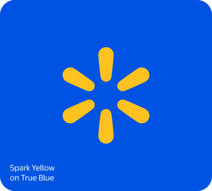
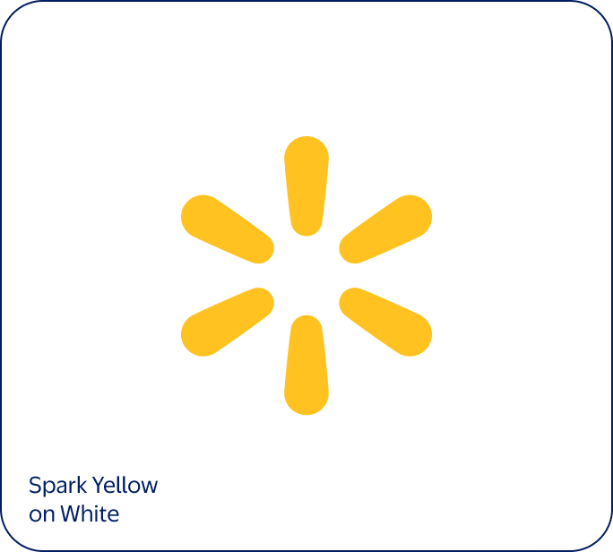
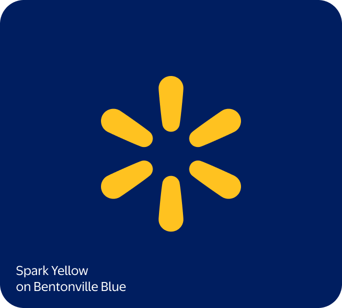
Our Spark should mainly appear in Spark Yellow with a True Blue or White background. In small-scale uses, Spark Yellow can be used on Bentonville Blue for max contrast and legibility.
Secondary Color Usage
If Spark Yellow doesn't provide enough contrast, it can appear in White. This should be used in small applications and as a supporting role to messaging or imagery.
Minimum Sizing
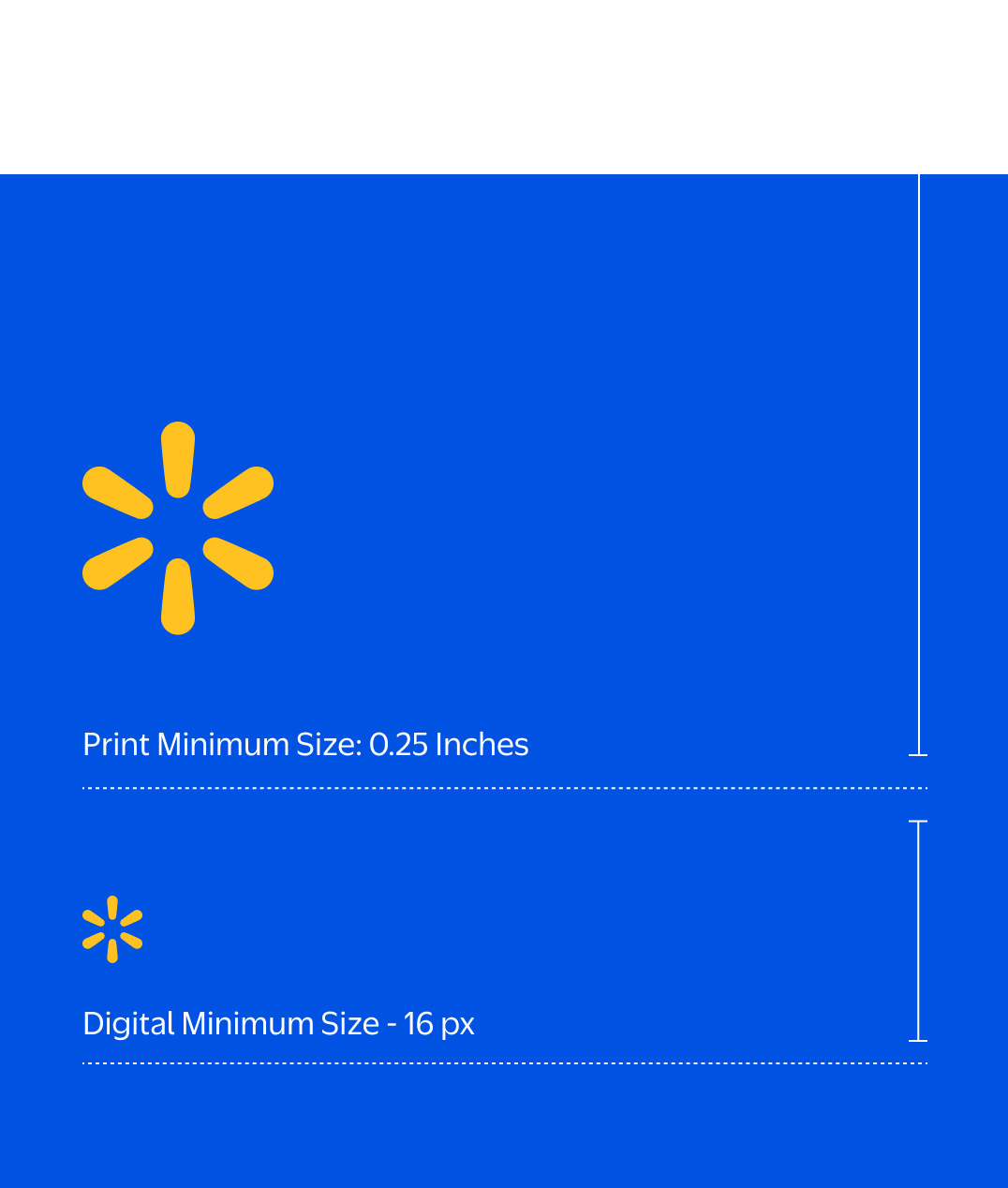
To ensure legibility, we don’t use our Spark at sizes smaller than 16 pixels high in digital applications or 0.25 inches high in print.
Print Minimum Size - 0.25 inch
Digital Minimum Size - 16 px
Note
Sparks here are not shown to scale. Refer to pixel and inch measurements for proper sizing.
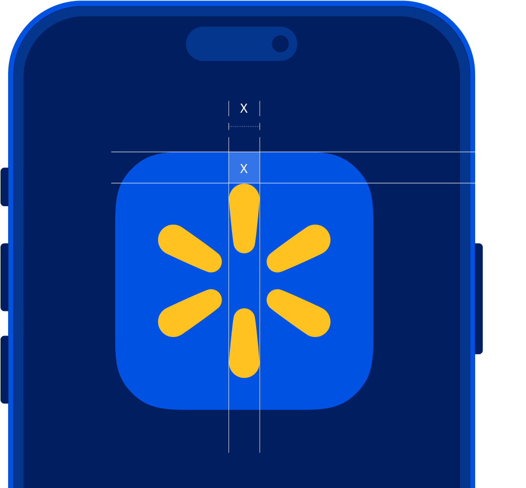
App Icon
In our app, the Spark is always in Spark Yellow with a True Blue background with our usual clearspace.
Holding Shapes
When using the Spark for pins, patches, stickers, or other merch that needs the logo to be die cut or molded, we can use one of the holding shapes here.
These are limited use graphics and shouldn’t be used as a substitute for the primary logo.
Note
Don't use any other holding shapes for the Spark, aside from when it’s depicted in our app icon.
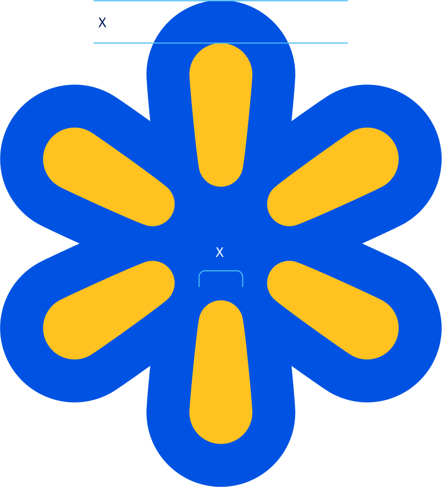
Form-Fitting Border
Border width is equal to narrow end of each Sparklet.
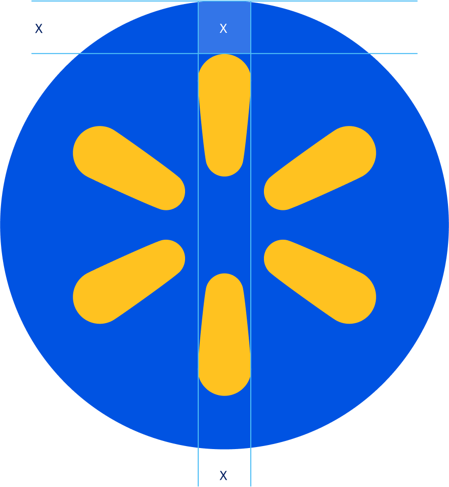
Circle
Clear space is equal to the width of one Sparklet.
Spark Don'ts
Don’t use the Spark in unapproved colors.
Don’t use a partially transparent Spark.
Don’t separate or remove pieces of the Spark.
Don’t use individual Sparklets for any purpose.
Don’t crop off the edges of the Spark.
Don’t use multiple colors on the Spark.
Don’t create a pattern out of the Spark.
Don’t apply our Waterfall to the Spark.
Don’t tilt or rotate or skew the Spark.